Monday, November 14, 2011

A portrait? Sure, no problem


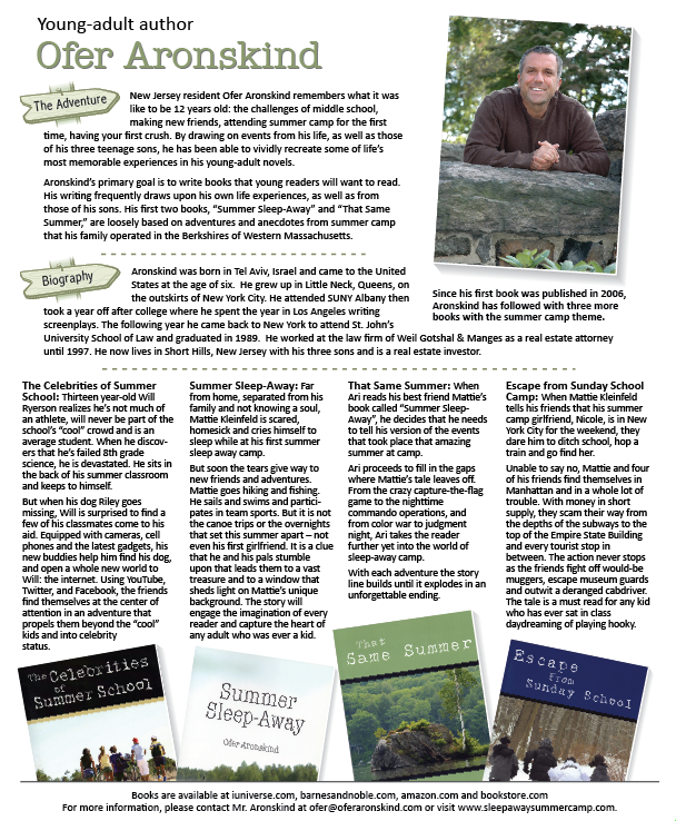
I was recently asked if I "do photography" while talking over a freelance job of redesigning a factsheet of young-adult author Ofer Aronskind. I immediately said yes, but then thought to myself, "does he mean professionally?" I'm always taking photos of my family, vacation scenes and of my garden, but I really haven't thought about taking it to a professional level. I have a nice camera and understand the basics of photography so, really, what was stopping me from tackling this? I had to at least give it a try. Ofer seemed like a nice guy and would work with me on this one.

The factsheet, which included cover images of the four books he has written since 2006, needed a fresh photo of him and the plan was to also use the photo for his upcoming book's back cover.

The above photos were the top selection out of a few dozen that I took at a local park on a beautiful day. Ofer ended up selecting the middle photo for the factsheet.

Click images for a larger view.

Wednesday, September 7, 2011

Old coal plants

Team Bell assembled this interactive which involved an animator, Flash AS3 coder and an environmental reporter in Montana. We basically had all the elements and skills for a really slick package, showing the rise in the production of old style coal plants without the needed pollution controls. As the need for electricity in the U.S. grows, more of these type plants are being built while the nation waits for the technologies to curb greenhouse gas pollution in clean-coal plants become available.

My role in this assignment was being the researcher, designer and anchor.

Wednesday, August 31, 2011

Iconography

Iconography is the branch of art history which studies the identification, description, and the interpretation of the content of images. The word iconography literally means "image writing" ... so says that tried and trusted quick online reference that I would only use for this blog and not as a professional source (of course) – Wikipedia. It pretty much says it all. The visual explainer to icons has to be immediate.

For the love of type


Kerning, leading, bold, italic, stacked ... there are so many ways to manipulate type. Knowing just how far to push the visual of it depends on context of its use. This Christmas "page topper" was designed to be used over the mast of a newspaper, appearing nicely in the old metal racks and on newsstands.

This "art head" was used on a features weekend page, showcasing acts that were in town playing at local bars and concert venues.

This type and illustration vector image was a "promo" used on the front page in the mast area to promote the Talladega special section. There is a huge audience for this reporting down South and it is spreading in its popularity nationwide.

The gambler


Here's a blast from the past ... When I was an artist at the Birmingham Post-Herald I had to come with an illustration of Tommy Tubberville who was Auburn's football coach between 1999-2008. During his first year there he was portrayed as a risk taker during clutch plays. So the guys in the Sports department did a piece on him being a "gambler" and this is the illustration I came up with.

Monday, August 15, 2011

Grading the Gulf of Mexico after the spill

After the BP oil spill, oceanographers familiar with the Gulf of Mexico were asked to give their assessment of the water quality and grade various categories. Surprisingly, the overall view for the viability of the Gulf was good.

See the interactive here:

Toxic water in schools

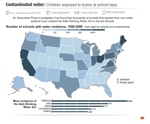
I worked on this investigative piece with an environmental reporter who was able to get 10 years of water surveys from the Environmental Protection Agency. In her series of reports, she verified that toxins were being leaked into schools' water supply - mostly in rural areas and off city water systems and relied on wells.

A majority of the pollutants came from chemicals found in agricultural fertilizers. Check out the link to see the interactive. This was a collaberative effort with me working with a Flash programmer:

Taking a break to draw

This illustration was done for a feature story about protecting your fall and spring bulbs from varmints. As much as I love spot news at work, it is great to vary the pace some and slow down and draw something. The font was converted to paths and manipulated slightly for a custom look.

Every year I try to supplement the collection of bulbs in my yard. So far, I can say that I don't believe I have ever had a problem with them being unearthed and used as nourishment.

Thursday, June 16, 2011

Quickies


These are a selection of graphics that I didn't have a lot of time to invest in an elaborate production. Working in the news industry can at times be like a game of Pictionary. When you are handed the assignment, the challenge is to knock it out in a timeframe that will convey the image convincingly to the viewer for the win.

Repurposing the Gulf Stream


Engineers have found a way to redirect the energy of the Gulf Stream into a usable energy source. The concept is very similar to how turbines convert wind into energy.

This graphic was a "spot" graphic which means the news was for the news cycle you were working and had to be completed on your shift. I just remember pushing to get it done quickly to get it out to members and making sure that it all made sense.

Newly married and your new set of friends

Getting married brings together lots of things into your new life as husband and wife like his furniture from the 80s, a new mix of music to your iTunes library and his friends that can take some getting use to with time.

This illustration was roughly sketched in pencil, then scanned and traced over in Illustrator.

A really expensive seed vault

This was a really interesting feature story on preserving seeds so future generations would have certain foods. The seed vault provides insurance against the loss of seeds, as well as a refuge for seeds in the case of large scale regional or a global crisis. Very thought provoking.


The illustration uses an isometric design of the vaults. The map was generated using Map Studio (an online GIS system).

The perfect swimsuit for your shape

Any woman can tell you how daunting it can be to select a swimsuit that compliments your unique body. This informational graphic assists in helping determine your shape first and understanding the newest swimsuit styles that compliment it.

This assignment uses fun fonts and pastel summer colors to help convey the season.

New CPR guidelines

These step-by-step health graphics are so popular as you can imagine, especially if the rendering is presented simply and the text is edited really tightly.

The American Heart Association released the new guidelines early in the day and I worked with the medical reporter and editor to get this out as soon as possible. The new process states to directly apply chest compressions to keep oxygenated blood flowing through the body, especially to the brain, skipping the mouth-to-mouth resuscitation.

Here is the earlier version of this process I did before the new guidelines were released. It ran for weeks as an "Editors' Pick" on Yahoo! News.

The perfect Christmas bows

The assignment here was to create a process graphic showing how to tie a Christmas bow using cloth ribbon that actually looks like one made by a professional gift wrapper (if there is such an occupation).

The images were drawn in Illustrator but because hands were involved and knowing how tricky it can be to draw these, photographs were taken of me holding the ribbon. The photos were then scanned and drawn, adjusting the illustration accordingly for the best representation for the particular step. As with most of my assignments, I wrote the headline and text.

An video for online broadcast was made with this particular package of me making the "pompom" and "florist" bow. Very Martha - a good thing!

Carving the Thanksgiving turkey

Knowing how to carve the bird at Thanksgiving is not only an essential skill to have but an honor in most households. This informational graphic gives basic tips on getting the job done and handy tips on making the annual event less frantic.

I contacted the National Turkey Federation media representative for the information for this assignment and came up with the layout and illustration for the package.

Napkin folding 101

The "Napkin Folding" assignment was for the upcoming holiday gatherings. Putting together a beautiful table for family and friends at Thanksgiving and Christmas is made all the more special complimented with an attractive display of cloth napkins.

I illustrated the how-to icons, shot the photography for this and provided the text for this. The icons were drawn in Adobe Illustrator and the color selection was kept to a minimum so as not to over-power any other photos that were in the package.