Iconography is the branch of art history which studies the identification, description, and the interpretation of the content of images. The word iconography literally means "image writing" ... so says that tried and trusted quick online reference that I would only use for this blog and not as a professional source (of course) – Wikipedia. It pretty much says it all. The visual explainer to icons has to be immediate.
Wednesday, August 31, 2011
For the love of type

Kerning, leading, bold, italic, stacked ... there are so many ways to manipulate type. Knowing just how far to push the visual of it depends on context of its use. This Christmas "page topper" was designed to be used over the mast of a newspaper, appearing nicely in the old metal racks and on newsstands.

This "art head" was used on a features weekend page, showcasing acts that were in town playing at local bars and concert venues.

This type and illustration vector image was a "promo" used on the front page in the mast area to promote the Talladega special section. There is a huge audience for this reporting down South and it is spreading in its popularity nationwide.
The gambler

Here's a blast from the past ... When I was an artist at the Birmingham Post-Herald I had to come with an illustration of Tommy Tubberville who was Auburn's football coach between 1999-2008. During his first year there he was portrayed as a risk taker during clutch plays. So the guys in the Sports department did a piece on him being a "gambler" and this is the illustration I came up with.
Monday, August 15, 2011
Grading the Gulf of Mexico after the spill

After the BP oil spill, oceanographers familiar with the Gulf of Mexico were asked to give their assessment of the water quality and grade various categories. Surprisingly, the overall view for the viability of the Gulf was good.
See the interactive here:
Toxic water in schools
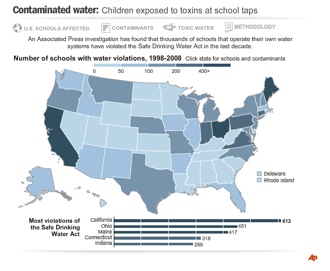
I worked on this investigative piece with an environmental reporter who was able to get 10 years of water surveys from the Environmental Protection Agency. In her series of reports, she verified that toxins were being leaked into schools' water supply - mostly in rural areas and off city water systems and relied on wells.
A majority of the pollutants came from chemicals found in agricultural fertilizers. Check out the link to see the interactive. This was a collaberative effort with me working with a Flash programmer:
Taking a break to draw

This illustration was done for a feature story about protecting your fall and spring bulbs from varmints. As much as I love spot news at work, it is great to vary the pace some and slow down and draw something. The font was converted to paths and manipulated slightly for a custom look.
Every year I try to supplement the collection of bulbs in my yard. So far, I can say that I don't believe I have ever had a problem with them being unearthed and used as nourishment.
Thursday, June 16, 2011
Quickies


These are a selection of graphics that I didn't have a lot of time to invest in an elaborate production. Working in the news industry can at times be like a game of Pictionary. When you are handed the assignment, the challenge is to knock it out in a timeframe that will convey the image convincingly to the viewer for the win.
Subscribe to:
Posts (Atom)